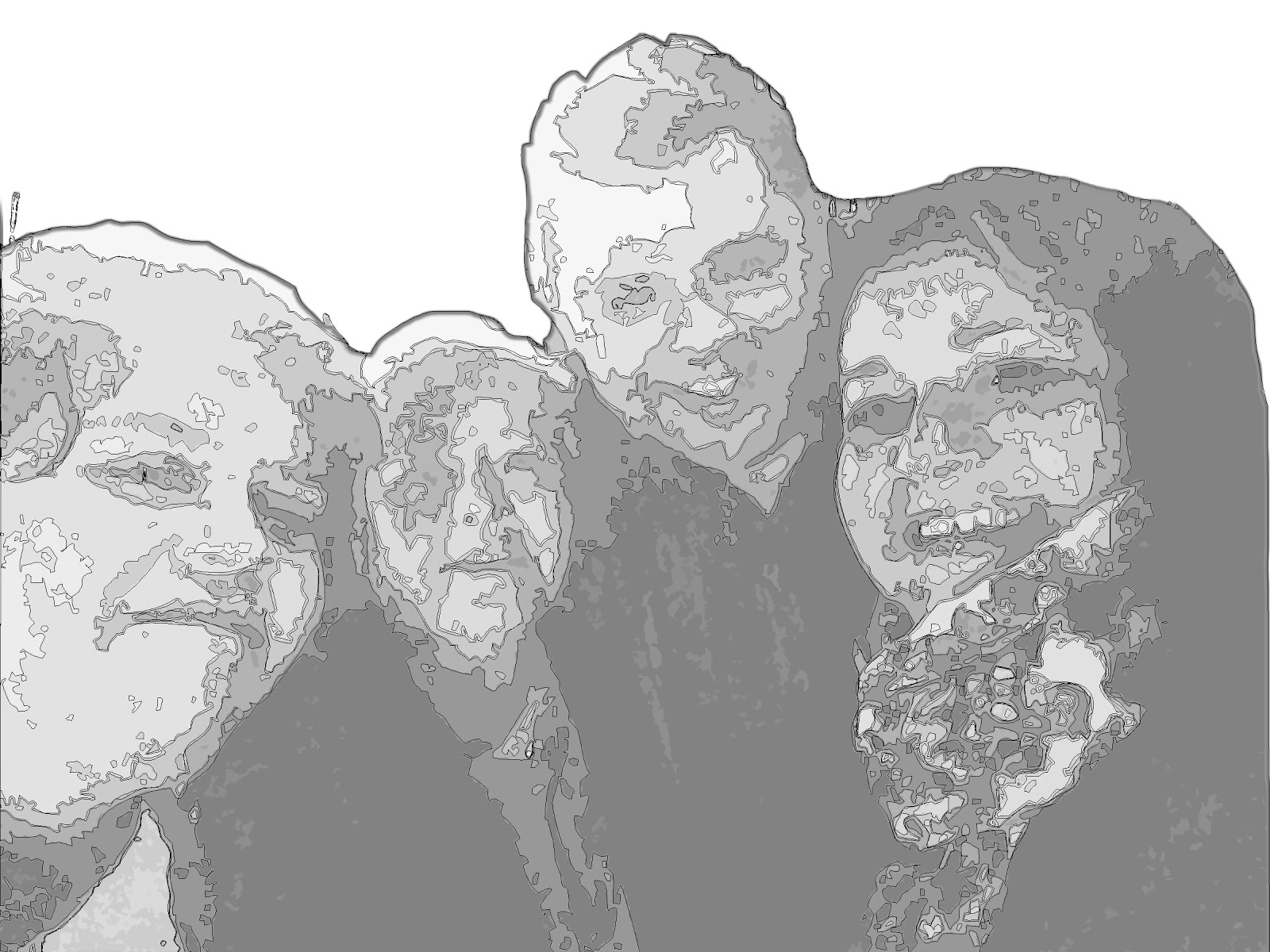
It was a long, but worthwhile, learning process. I was a bit overwhelmed with the images of my family and friends. I went to Photoshop and made each image into paths and created 5 different shades and took the shapes into illustrator but they weren't translating as well in Illustrator. So I just took the gradient images and made them transparent with a map in a layer underneath. But eventually I gave the attention that they deserved.


I decided to make zoom-in windows of the the Valley and LA Maps. The key is crucial in understanding the chronology of the moves.


And Finally the titles I chose are a throwback to one of my favorite movies as a kid, "An American Tale". I looked up the font used and I was able to download it for free from Font Meme.com. I gave the same details that are show in the movie poster.


The task of fitting of the images inside of the designated maps proved the biggest challenge. 
The next challenge in this project was matching up the maps so that they overlapped or that they showed the same area to scale. I had 15 google maps screenshots for each move. I figured the proximity of the locations was what was important.

I decided to make zoom-in windows of the the Valley and LA Maps. The key is crucial in understanding the chronology of the moves.


And Finally the titles I chose are a throwback to one of my favorite movies as a kid, "An American Tale". I looked up the font used and I was able to download it for free from Font Meme.com. I gave the same details that are show in the movie poster.


In the end, I feel satisfied with the final product.


No comments:
Post a Comment
Note: Only a member of this blog may post a comment.